01 - Extract UI Items
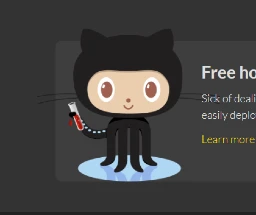
Octocat

User Interface Discussion
I like Octocat because some of his features extend past the text and other parts of the element.
From what I can tell, the img margin allows octocat to appear that his features overhang over other parts of the element.
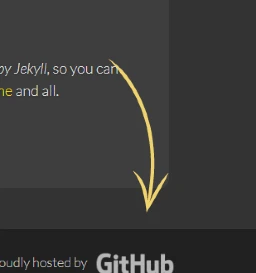
Arrow Next To Octocat

User Interface Discussion
Same as Octocat, I like this item because it sticks out and seems to almost jump off of the page.
Same techniques used as Octocat.
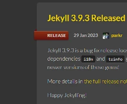
Ribbons on News Page

User Interface Discussion
Similar to the octocat and the arrow, the styling makes the image seem like its a ribbon wrapped around the element
I'm not sure I understand how, but it has something to do with the ::before in the class.
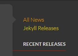
Small Arrows on Aside Section

User Interface Discussion
Again, this is a very subtle little item on the web page that makes it pop out at you.
Similar to the Ribbons, this uses a ::before to work.